
Nexara Pacific's own brand identity.
The logo, business cards, and color system are Ranae Tang's own work: a full brand identity built for Nexara Pacific Technologies itself. The brief: one shared identity for a studio running two distinct practices, reading as considered and human rather than a templated agency. It also specifically avoids the dark-hero, glowing-gradient look most AI-consulting competitors default to. The mark, the color system, and the print collateral all come from the same project.
What was the goal?
Design one identity that works for both practices without either one disappearing into the other. Darrell's AI-consulting work and Ranae's design work needed to feel like part of the same studio, not two unrelated businesses sharing a logo.
The mark
A connected-nodes mark reads as a network or workflow, which fits an AI-consulting practice built around fixing how work moves through a business, and doubles as a distinctive, non-generic brand mark for the design side.

Extending it to print
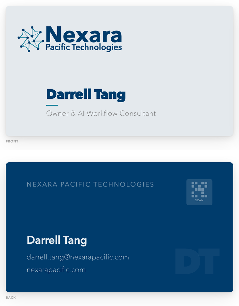
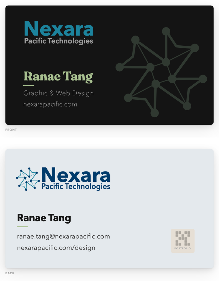
Business cards carry the same mark and color system, adapted for a printed, tactile piece, and adapted again for each practice. Darrell's card stays restrained navy and teal; Ranae's uses the same structure with her sage accent instead. Same system, same mark, different practice color, so the two cards read as one studio rather than two.
The color system
Navy carries shared, structural elements: nav, footer, wordmark. Teal is reserved for AI-consulting pages and sage for design pages, never both on one screen, so you always know which practice you are looking at. One studio, two practices, each with its own accent inside a shared system.
Want something like this for your business?
Brand identity is the first of three fixed-scope design packages. See how it's scoped, or describe your project and Ranae will follow up directly.